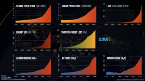
About 3 years ago, I read a book called Drawdown about the most promising available climate solutions. It was refreshing, because at the time there wasn’t much discussion about how we could serious start addressing climate change at scale. I recently discovered that the book is now an entire project, Project Drawdown, which includes a free “Climate Solutions 101” course. i just completed the first unit, and one point it raised that really blew my mind is how much we’ve done just since 1950. I mean, you could have been born in/around 1950! Your parents or your grandparents almost certainly were. That’s not a long time ago! That’s not a time when we picture people living very differently than we live today. But I guess it was. As the charts plainly show, we have radically altered the absolute fundamentals of our lives – our air, water and soil – just since 1950.
A graphic from NASA shows the stark increase in CO2 in the same period. For 800,000 years before 1950, CO2 in our atmosphere fluctuated from around 200 parts per million during ice ages to around 280 parts per million in warmer time periods. In 1950, it got to around 300 parts per million. And then it just skyrocketed. It’s literally a straight line up, and in 2013 it surpassed 400 parts per million. Per the NOAA, CO2 levels in the atmosphere in June 2021 were about 419 parts per million. Mull on that one.
But why? Why are we so addicted to the growth, the striving, the production, and the convenience of our modern times?
נערות ליווי באילת שירותי ליווי באילת says:
Very nice article. I definitely love this site. Thanks!
דירות דיסקרטיות בחיפה לאירוח מושלם says:
I would like to thank you for the efforts youve put in penning this site. I really hope to view the same high-grade content by you later on as well. In fact, your creative writing abilities has inspired me to get my own website now 😉
נערות ליווי לבילוי מושלם, 30 דקות ונערת ליווי אצליך - israel lady says:
Good post. I learn something new and challenging on blogs I stumbleupon everyday. It will always be interesting to read articles from other authors and use a little something from their sites.